Lecture 08-2: Advanced Statistics in SQL
DATA 503: Fundamentals of Data Engineering
March 2, 2026
Advanced Statistics in SQL 📊
Your database isn’t just a filing cabinet. It’s a statistics lab.
Today we discover that SQL has been hiding superpowers from you this whole time.
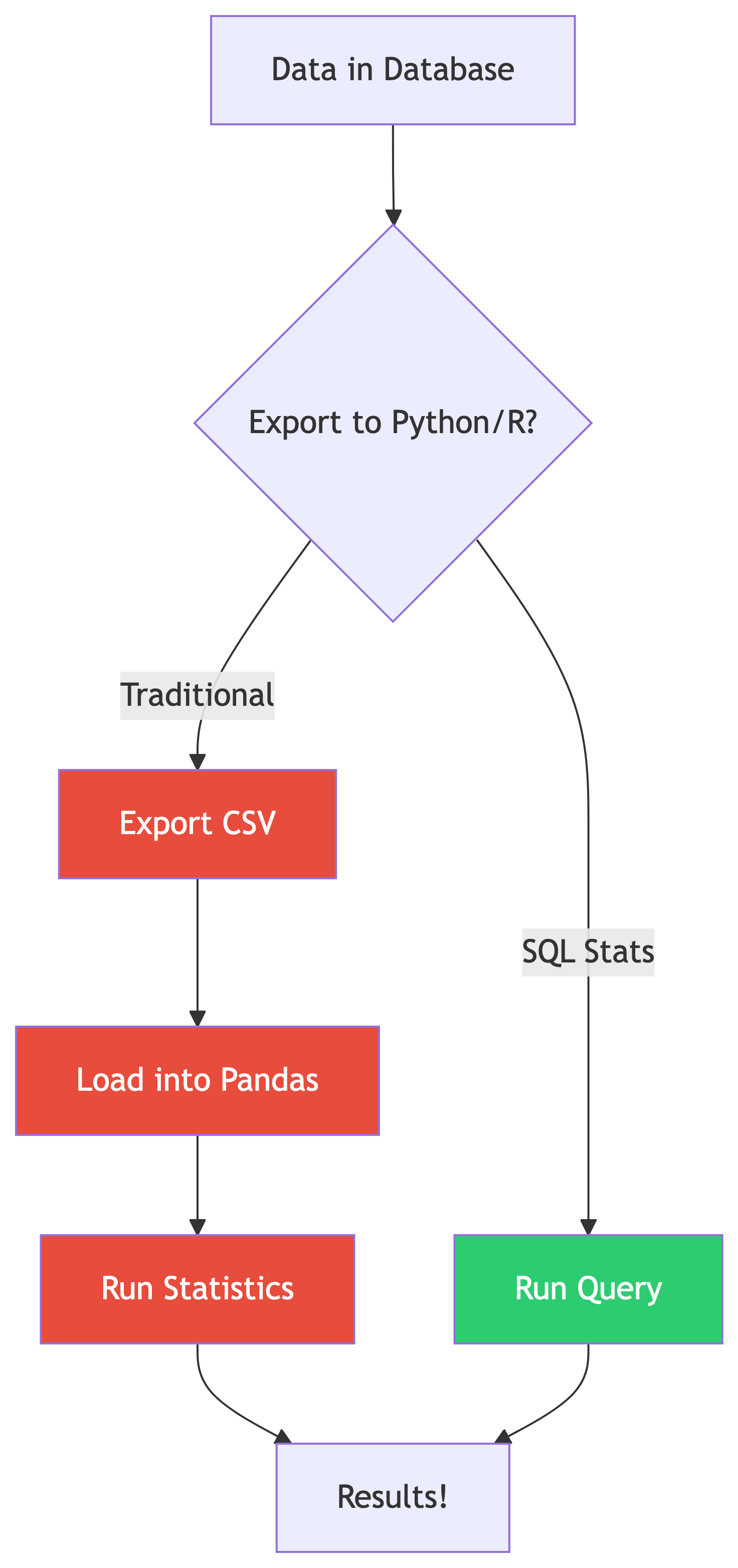
Why Statistics in SQL?
The Case for In-Database Stats
Why not just use Python/R?
- No data movement = faster iteration
- Stats computed where data lives
- Works on billions of rows without loading into memory
- Perfect for quick exploratory analysis
SQL statistical functions are aggregate functions on steroids 💪
Standard ANSI SQL (including PostgreSQL) includes powerful stats functions. You don’t need to leave the database!
What SQL Gives You
| Category | Functions |
|---|---|
| Correlation | corr(Y, X) |
| Regression | regr_slope(), regr_intercept(), regr_r2() |
| Spread | var_pop(), stddev_pop(), var_samp(), stddev_samp() |
| Ranking | rank(), dense_rank(), row_number() |
| Windows | OVER(), PARTITION BY, frame clauses |
That’s a full intro stats course hiding in your database engine. 🤯
Setting Up: Follow Along 🗂️
Loading the Data
The Data Files
All data files live in the ch11/ folder. Here’s what we’re working with:
| File | What It Contains |
|---|---|
acs_2014_2018_stats.csv |
American Community Survey: education, income, commute data for every US county |
cbp_naics_72_establishments.csv |
Census County Business Patterns: restaurant/hotel counts per county |
us_exports.csv |
Monthly US citrus and soybean export values (2002-2020) |
We’ll load these as we go. First up: the ACS data.
Step 1: Create the ACS Table
That CHECK constraint is doing real work: it ensures the master’s percentage never exceeds the bachelor’s percentage. If your import violates this, you’ve got a data quality problem. 🧠
Step 2: Import the CSV
Use \copy in psql (update the path to wherever your files live):
Sanity Check ✅
Every county in America is now in your database. All 3,142 of them. 🇺🇸
What’s In the ACS Data?
| Column | What It Measures |
|---|---|
pct_travel_60_min |
% of workers ages 16+ with 60+ minute commute |
pct_bachelors_higher |
% of people ages 25+ with bachelor’s degree or higher |
pct_masters_higher |
% of people ages 25+ with master’s degree or higher |
median_hh_income |
Median household income (2018 inflation-adjusted dollars) |
The big question: Does education really pay? 💰
Let’s find out with math.
Correlation: Finding Relationships 🔗
Measuring Correlation
What Is Correlation?
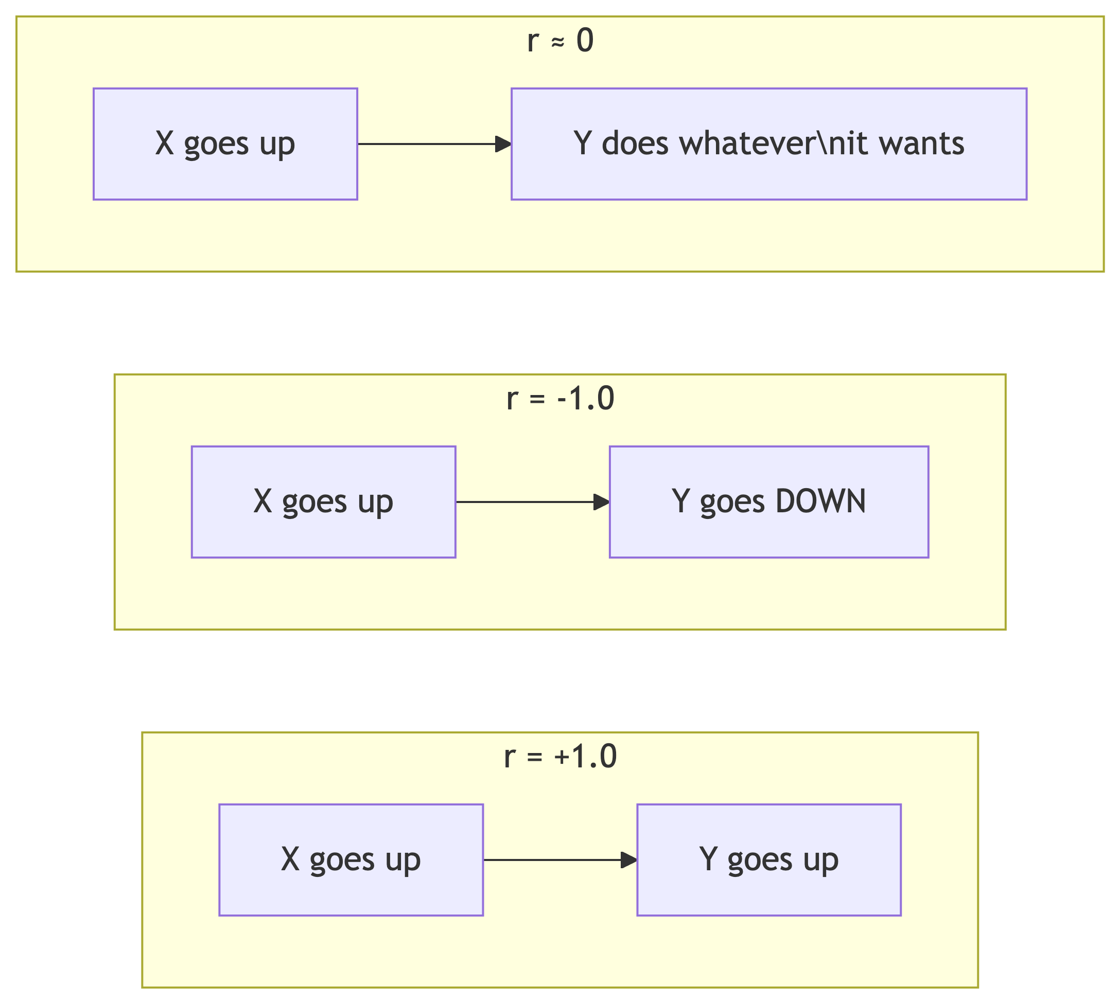
The Pearson correlation coefficient (r) measures the strength and direction of a linear relationship between two variables.
| r Value | Interpretation |
|---|---|
| 0 | No relationship |
| .01 to .29 | Weak |
| .30 to .59 | Moderate |
| .60 to .99 | Strong to nearly perfect |
| 1 | Perfect |
Same ranges apply for negative values (inverse relationship).
The corr(Y, X) Function
SQL’s corr() is a binary aggregate function: it takes two inputs.
- Y = dependent variable (what you’re measuring)
- X = independent variable (what you think influences Y)
Result:
bachelors_income_r
------------------
0.6999086502599159
That’s r ≈ 0.70, a strong positive correlation. Counties with more bachelor’s degrees tend to have higher median incomes. Stay in school, kids. 🎓
Comparing Multiple Correlations
Let’s check several relationships at once and round for readability:
| Relationship | r | What It Means |
|---|---|---|
| Education → Income | 0.70 | Strong: more degrees = more money |
| Income → Long Commute | 0.06 | Basically nothing |
| Education → Long Commute | -0.14 | Weak inverse: more education, slightly less commuting |
Money doesn’t make your commute longer. That’s a relief. 🚗
Why ::numeric?
corr() returns a double precision float. We cast to numeric so round() can accept it. This is PostgreSQL-specific syntax.
⚠️ The Big Caveat
Correlation ≠ Causation!
A strong correlation tells you two things move together. It does NOT tell you one causes the other.
Classic example: ice cream sales and drowning deaths are highly correlated. That doesn’t mean ice cream kills people. 🍦☠️ (They’re both driven by hot weather.)
Check out tylervigen.com/spurious-correlations for hilariously absurd correlations, like the divorce rate in Maine correlating with margarine consumption.
✅ Knowledge Check: Correlation
Try It Yourself!
What is the correlation between
pct_masters_higherandmedian_hh_income? Is it higher or lower than the bachelor’s correlation? What might explain the difference?If
corr()returns-0.45, what does that tell you about the relationship between the two variables?Does switching the order of inputs in
corr()change the result? Try it!
🔑 Solution 1: Masters vs. Income Correlation
Step 1: Write the query, swapping pct_bachelors_higher for pct_masters_higher:
Step 2: Compare the result:
| Variable | r |
|---|---|
| Bachelor’s | 0.70 |
| Master’s | ~0.60 |
The master’s correlation is lower. Why? Fewer people hold master’s degrees, so there’s less variation in that column across counties. Less variation = weaker signal for the correlation to pick up on. Also, master’s degree holders are a subset of bachelor’s degree holders, so the bachelor’s measure captures a broader (and more predictive) slice of educational attainment.
🔑 Solution 2: Interpreting r = -0.45
Step 1: Check the sign. Negative = inverse relationship.
Step 2: Check the magnitude. 0.45 falls in the moderate range (0.30 to 0.59).
Answer: A correlation of -0.45 tells you there’s a moderate inverse relationship: as one variable increases, the other tends to decrease. Not a strong lock-step decline, but a clear pattern.
🔑 Solution 3: Does Input Order Matter?
Answer: Both return the same value (~0.70). Correlation is symmetric: corr(Y, X) = corr(X, Y). The function signature says Y, X for convention (matching regression), but the math doesn’t care about order. 🔄
Regression: Predicting Values 📈
Linear Regression in SQL
From Correlation to Prediction
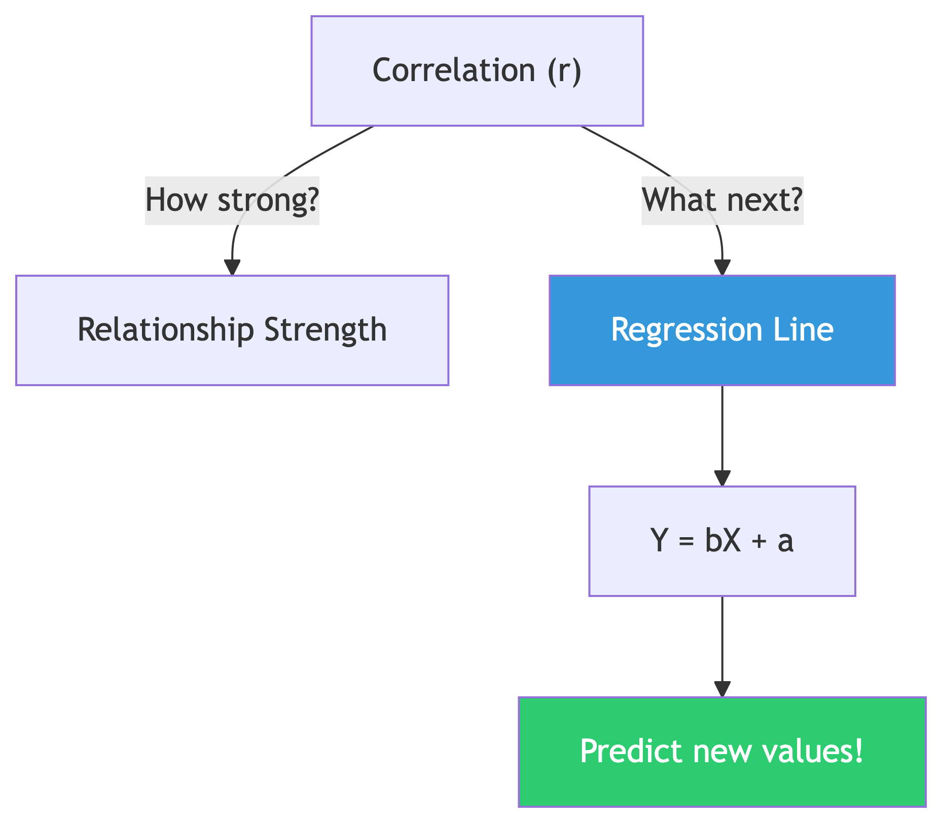
Correlation tells you if a relationship exists.
Regression gives you the equation to make predictions.
Y = bX + a (the least squares regression line)
- b = slope (
regr_slope) — how much Y changes per unit of X - a = y-intercept (
regr_intercept) — Y value when X is zero - Y = dependent variable (predicted value)
- X = independent variable (known value)
Computing Slope and Intercept
Given bachelor’s degree percentage, predict median income:
Result:
 slope     y_intercept
-------   -----------
1016.55     29651.42
Translation: For every 1% increase in bachelor’s degree holders, median income goes up by about $1,016.55 💵
Using the Equation
Our regression line: Y = 1016.55X + 29,651.42
What income would we predict for a county where 30% have bachelor’s degrees?
Y = 1016.55(30) + 29,651.42
Y = 30,496.50 + 29,651.42
Y = 60,147.92
We’d predict a median household income of about $60,148. 🎯
That’s the power of regression: turning known data into predictions about data you haven’t seen yet.
R-Squared: How Good Is the Fit?
The coefficient of determination (R²) tells us what percentage of variation in Y is explained by X:
Result:
r_squared
---------
    0.490
R² = 0.490 means education explains about 49% of the variation in median household income across counties.
That’s solid for a single variable! But 51% is explained by other factors: cost of living, industry mix, geography, etc. Real-world data is messy. 🤷
✅ Knowledge Check: Regression
Try It Yourself!
Use
regr_slopeandregr_interceptwithpct_masters_higheras the X variable. How does the slope compare to the bachelor’s version?Calculate R² for masters vs. income. Does a master’s degree predict income better than a bachelor’s?
Using the bachelor’s regression equation, predict income for a county with 50% bachelor’s holders. Does it seem realistic? What are the limits of this approach?
🔑 Solution 1: Master’s Regression
Step 1: Swap in pct_masters_higher as the X variable:
Step 2: Compare slopes:
| X Variable | Slope | Meaning |
|---|---|---|
| Bachelor’s | 1,016.55 | Each 1% more bachelor’s = +$1,017 income |
| Master’s | ~2,000+ | Each 1% more master’s = +$2,000+ income |
The master’s slope is steeper! That makes sense: master’s degrees are rarer, so each percentage point of increase represents a bigger shift in a county’s educational profile. The “per unit” impact is larger, but there are fewer units to work with.
🔑 Solution 2: R² Comparison
| Variable | R² | % Explained |
|---|---|---|
| Bachelor’s | 0.490 | 49% |
| Master’s | ~0.360 | ~36% |
Bachelor’s degree percentage is the better predictor. It explains about 49% of income variation vs. ~36% for master’s. More data points, more variation, more predictive power. 📊
🔑 Solution 3: Predicting at 50%
Step 1: Plug X = 50 into our equation:
Y = 1016.55(50) + 29,651.42
Y = 50,827.50 + 29,651.42
Y = 80,478.92
Step 2: Does ~$80,479 seem realistic? It’s high but plausible for a highly educated county (think: suburban counties near DC or San Francisco).
Step 3: The limits:
- We’re extrapolating beyond most of our data (few counties hit 50%)
- Linear regression assumes a straight line forever, but reality has diminishing returns
- Other factors (cost of living, industry) aren’t in the model
- The R² of 0.49 means 51% of variation is unexplained!
Regression is a flashlight, not a crystal ball. 🔦
Variance and Standard Deviation 📐
Measuring Spread
Why Spread Matters
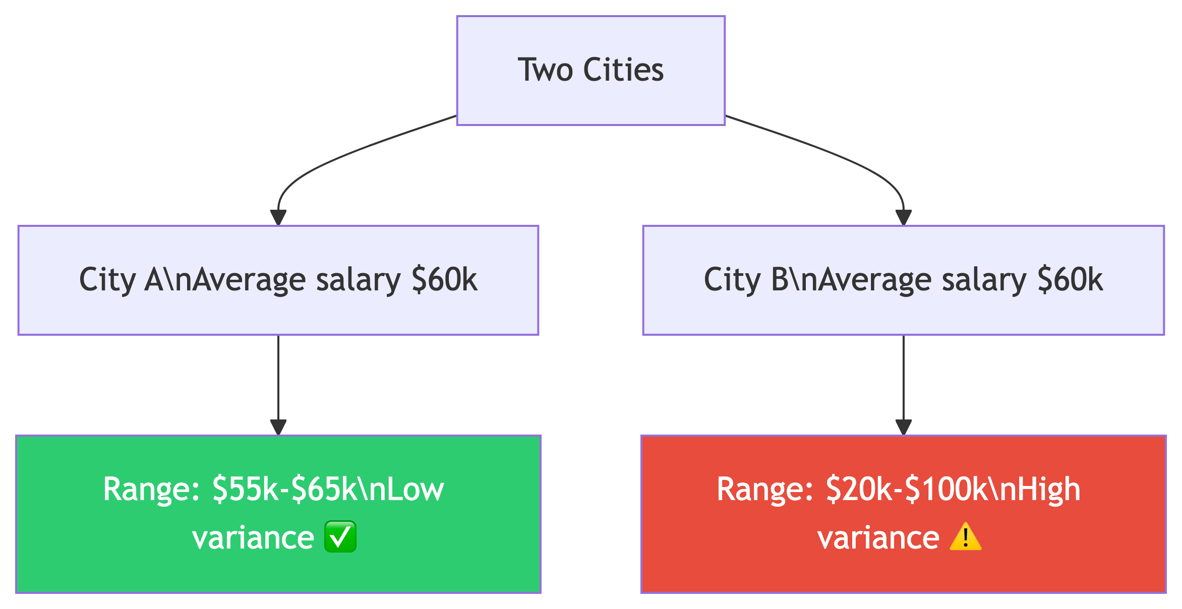
Same average, wildly different stories.
- Variance = average of squared deviations from the mean (different units!)
- Standard deviation = square root of variance (same units as data)
| Function | What |
|---|---|
var_pop() |
Population variance |
var_samp() |
Sample variance |
stddev_pop() |
Population std dev |
stddev_samp() |
Sample std dev |
Population vs. Sample
When to Use Which?
- Population (
_pop): Your data IS the entire population. We have all 3,142 US counties, so we use population functions. - Sample (
_samp): Your data is a subset of a larger population, like a random survey of 500 counties.
Standard deviation is expressed in the same units as your data. Variance is not. It’s on its own scale, which is larger than the original units.
Computing Spread
Think about what the standard deviation tells you: in a normal distribution, about two-thirds of values fall within one standard deviation of the mean, and 95% within two standard deviations.
If mean income is ~$50k and std dev is ~$12k, most counties fall between ~$38k and ~$62k. 📊
✅ Knowledge Check: Spread
Think About It
Compute
stddev_popfor bothpct_bachelors_higherandpct_masters_higher. Which has more variation across counties?If the standard deviation of income is ~$12,000 and the mean is ~$50,000, roughly what range contains the middle 95% of counties? (Hint: 2 standard deviations)
When would you use
var_sampinstead ofvar_pop? Give a real-world example.
🔑 Solution 1: Comparing Variation
Step 1: Run both in one query:
Step 2: Compare the results:
| Variable | Std Dev |
|---|---|
| Bachelor’s | ~9.0 |
| Master’s | ~4.0 |
Bachelor’s percentage has more variation across counties. That makes sense: the range of bachelor’s attainment across US counties is much wider (some rural counties under 10%, some suburban counties over 60%) compared to master’s degrees which cluster in a narrower range.
🔑 Solution 2: The 95% Range
Step 1: Recall the rule: in a normal distribution, ~95% of values fall within 2 standard deviations of the mean.
Step 2: Calculate the range:
Lower bound = $50,000 - (2 × $12,000) = $26,000
Upper bound = $50,000 + (2 × $12,000) = $74,000
Answer: Roughly 95% of US counties have a median household income between $26,000 and $74,000. Counties outside this range are the outliers (very poor rural areas or very wealthy suburbs). 📊
🔑 Solution 3: Population vs. Sample
Use var_samp / stddev_samp when your data is a sample, not the whole population.
Real-world examples:
- You survey 500 random customers out of 50,000 total → sample functions
- You poll 200 students from a university of 5,000 → sample functions
- You analyze all 3,142 US counties → population functions (that IS the whole population)
The difference: sample functions use N-1 in the denominator (Bessel’s correction) to account for the fact that a sample tends to underestimate the true population variance. With large N, the difference is tiny. With small samples, it matters! 🔬
Ranking with Window Functions 🏆
rank() and dense_rank()
Window Functions: The Big Idea
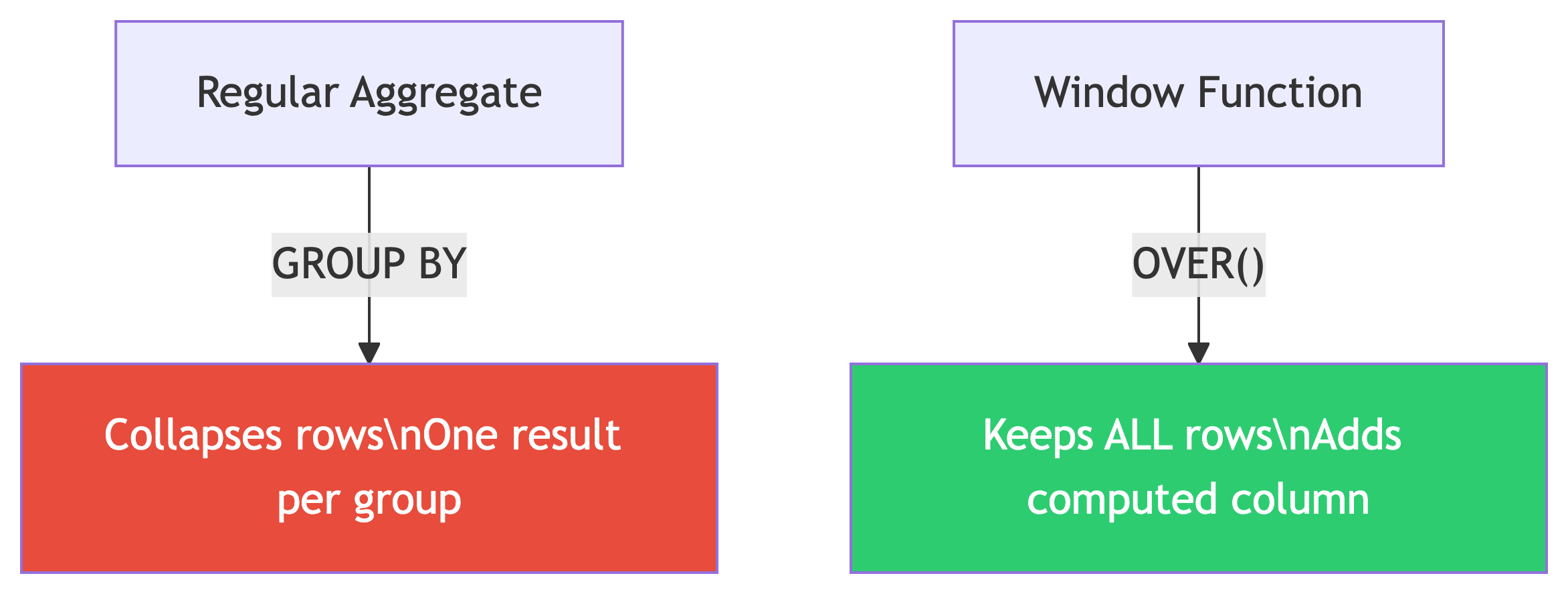
Aggregate functions collapse rows into summaries.
Window functions compute values across rows without collapsing them.
The magic keyword: OVER()
Think of it as: “compute this, but looking through a window at related rows.” The query first generates the result set, then the window function runs across it.
Setting Up the Widget Data
CREATE TABLE widget_companies (
    id integer PRIMARY KEY GENERATED ALWAYS AS IDENTITY,
    company text NOT NULL,
    widget_output integer NOT NULL
);

INSERT INTO widget_companies (company, widget_output)
VALUES
    ('Dom Widgets', 125000),
    ('Ariadne Widget Masters', 143000),
    ('Saito Widget Co.', 201000),
    ('Mal Inc.', 133000),
    ('Dream Widget Inc.', 196000),
    ('Miles Amalgamated', 620000),
    ('Arthur Industries', 244000),
    ('Fischer Worldwide', 201000);
Yes, those are Inception references. Christopher Nolan approves. 🎬
rank() vs dense_rank()
The Results: Spot the Difference
| company | widget_output | rank | dense_rank |
|---|---|---|---|
| Miles Amalgamated | 620,000 | 1 | 1 |
| Arthur Industries | 244,000 | 2 | 2 |
| Saito Widget Co. | 201,000 | 3 | 3 |
| Fischer Worldwide | 201,000 | 3 | 3 |
| Dream Widget Inc. | 196,000 | 5 | 4 |
| Ariadne Widget Masters | 143,000 | 6 | 5 |
| Mal Inc. | 133,000 | 7 | 6 |
| Dom Widgets | 125,000 | 8 | 7 |
After the tie at rank 3:
rank()skips to 5 (there are 4 companies ahead of Dream Widget)dense_rank()continues to 4 (no gaps, 3 distinct output levels ahead)
When to Use Which?
| Use Case | Function | Why |
|---|---|---|
| Competition rankings (Olympics) | rank() |
Two golds, no silver |
| Top-N distinct levels | dense_rank() |
Exactly N unique levels |
| Unique row numbering | row_number() |
No ties, ever |
In practice, rank() is used most often. It more accurately reflects the total number of items ranked ahead of a given row. 🥇
PARTITION BY: Ranking Within Groups 🗂️
Grouped Rankings
The Store Sales Data
CREATE TABLE store_sales (
    store text NOT NULL,
    category text NOT NULL,
    unit_sales bigint NOT NULL,
    CONSTRAINT store_category_key PRIMARY KEY (store, category)
);

INSERT INTO store_sales (store, category, unit_sales)
VALUES
    ('Broders', 'Cereal', 1104),
    ('Wallace', 'Ice Cream', 1863),
    ('Broders', 'Ice Cream', 2517),
    ('Cramers', 'Ice Cream', 2112),
    ('Broders', 'Beer', 641),
    ('Cramers', 'Cereal', 1003),
    ('Cramers', 'Beer', 640),
    ('Wallace', 'Cereal', 980),
    ('Wallace', 'Beer', 988);
Three stores. Three product categories. Who’s winning in each category? 🏪
Ranking Within Each Category
The Results
| category | store | unit_sales | rank |
|---|---|---|---|
| Beer | Wallace | 988 | 1 |
| Beer | Broders | 641 | 2 |
| Beer | Cramers | 640 | 3 |
| Cereal | Broders | 1104 | 1 |
| Cereal | Cramers | 1003 | 2 |
| Cereal | Wallace | 980 | 3 |
| Ice Cream | Broders | 2517 | 1 |
| Ice Cream | Cramers | 2112 | 2 |
| Ice Cream | Wallace | 1863 | 3 |
PARTITION BY restarts the ranking for each category. Broders dominates cereal and ice cream, but Wallace takes the beer crown! 🍺
How PARTITION BY Works
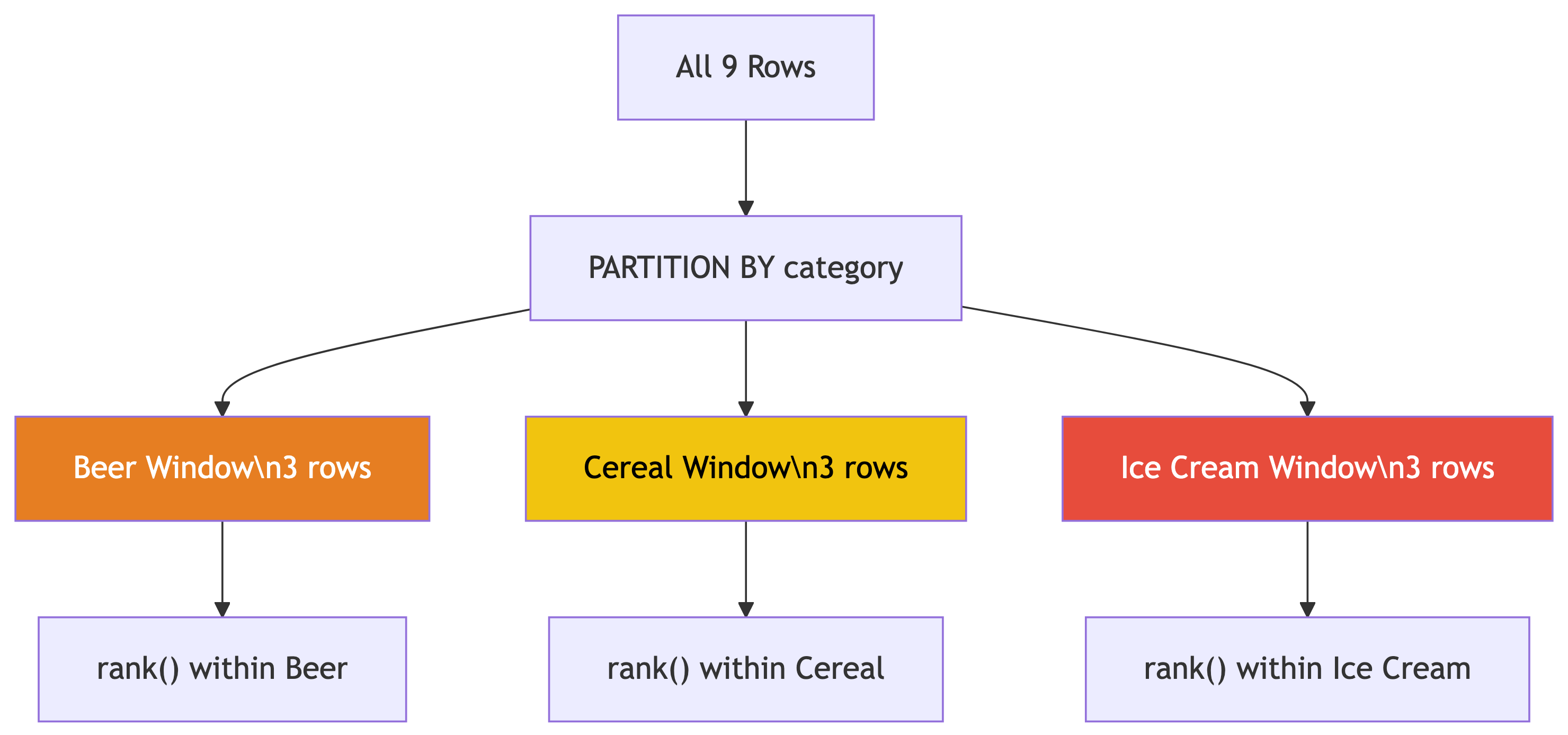
PARTITION BY creates separate windows for each group.
- Each partition gets its own ranking
- Rows outside the partition are invisible
- Original rows are preserved (not collapsed!)
Template:
You can apply this pattern everywhere: rank employees by salary within each department, movies by revenue within each genre, students by GPA within each major…
✅ Knowledge Check: Ranking
Try It Yourself!
Write a query that finds only the #1 ranked store in each category. (Hint: wrap the ranking query in a subquery or CTE and filter with
WHERE rank = 1)What would happen if you removed
PARTITION BYfrom the query? Try it!Add
row_number()alongsiderank()in the widget companies query. How doesrow_number()handle the tie between Saito and Fischer?
🔑 Solution 1: Top Store Per Category
Step 1: We can’t filter on a window function directly in WHERE (it hasn’t been computed yet). So we wrap it in a subquery or CTE:
Step 2: The result:
| category | store | unit_sales |
|---|---|---|
| Beer | Wallace | 988 |
| Cereal | Broders | 1104 |
| Ice Cream | Broders | 2517 |
This is a very common pattern: CTE with window function → filter in outer query. You’ll use this all the time. 💡
🔑 Solution 2: Without PARTITION BY
Step 1: Remove PARTITION BY:
Step 2: Now ALL 9 rows compete against each other in a single ranking:
| category | store | unit_sales | overall_rank |
|---|---|---|---|
| Ice Cream | Broders | 2517 | 1 |
| Ice Cream | Cramers | 2112 | 2 |
| Ice Cream | Wallace | 1863 | 3 |
| Cereal | Broders | 1104 | 4 |
| … | … | … | … |
Without PARTITION BY, ice cream dominates the top because those sales numbers are bigger overall. The category-level insight is lost. That’s why we partition! 🗂️
🔑 Solution 3: row_number() and Ties
Step 1: Add row_number() to the widget query:
Step 2: Look at the tied companies (201,000):
| company | rank | dense_rank | row_number |
|---|---|---|---|
| Saito Widget Co. | 3 | 3 | 3 |
| Fischer Worldwide | 3 | 3 | 4 |
row_number() assigns unique numbers even for ties. One gets 3, the other gets 4. Which one gets which? It’s arbitrary (the database picks). If you need deterministic tie-breaking, add more columns to the ORDER BY. 🎲
Rates: Meaningful Comparisons 🏢
Calculating Rates
Raw Counts Lie
Texas had 377,599 babies born in 2019. Utah had 46,826. So Texas women have more babies, right?
Not so fast. Texas had 9x the population of Utah. 🤔
The fertility rate (births per 1,000 women ages 15-44):
- Texas: 62.5
- Utah: 66.7
Utah actually had a higher birth rate! Always normalize by population.
Loading the Business Pattern Data
CREATE TABLE cbp_naics_72_establishments (
    state_fips text,
    county_fips text,
    county text NOT NULL,
    st text NOT NULL,
    naics_2017 text NOT NULL,
    naics_2017_label text NOT NULL,
    year smallint NOT NULL,
    establishments integer NOT NULL,
    CONSTRAINT cbp_fips_key PRIMARY KEY (state_fips, county_fips)
);

\copy cbp_naics_72_establishments
FROM '/your/path/to/ch11/cbp_naics_72_establishments.csv'
WITH (FORMAT CSV, HEADER);
This is NAICS code 72: Accommodation and Food Services (hotels, restaurants, bars). A good proxy for tourism activity. 🏖️
Business Rates Per Capita
SELECT
    cbp.county,
    cbp.st,
    cbp.establishments,
    pop.pop_est_2018,
    round(
        (cbp.establishments::numeric / pop.pop_est_2018) * 1000, 1
    ) AS estabs_per_1000
FROM cbp_naics_72_establishments cbp
    JOIN us_counties_pop_est_2019 pop
    ON cbp.state_fips = pop.state_fips
    AND cbp.county_fips = pop.county_fips
WHERE pop.pop_est_2018 >= 50000
ORDER BY cbp.establishments::numeric / pop.pop_est_2018 DESC;
Note
This requires the us_counties_pop_est_2019 table from Chapter 5. If you don’t have it loaded, focus on the pattern: normalize by population to compare fairly.
Top Tourism Counties
| county | st | establishments | pop_est_2018 | estabs_per_1000 |
|---|---|---|---|---|
| Cape May County | New Jersey | 925 | 92,446 | 10.0 |
| Worcester County | Maryland | 453 | 51,960 | 8.7 |
| Monroe County | Florida | 540 | 74,757 | 7.2 |
| Warren County | New York | 427 | 64,215 | 6.6 |
| New York County | New York | 10,428 | 1,629,055 | 6.4 |
Cape May = beach resorts. Worcester County = Ocean City. Monroe County = Florida Keys. 🏖️
New York County (Manhattan) has a massive raw count, but it’s only #5 per capita!
The Pattern: Rates, Not Counts

Always normalize when comparing across groups of different sizes.
The formula: (count / population) × 1,000
Real-world applications everywhere:
- Crime rates vs. crime counts
- COVID cases per 100k vs. raw cases
- Revenue per employee vs. total revenue
- Library visits per capita vs. total visits
Raw numbers mislead. Rates tell truth. 📊
Rolling Averages: Smoothing Noisy Data 🌊
Window Frames
Loading Export Data
Monthly US citrus and soybean export values from 2002 through 2020. Both are seasonal commodities tied to growing seasons. 🍊
The Problem With Raw Monthly Data
Citrus exports are wildly seasonal: huge spikes in winter (growing season paused in the northern hemisphere, so countries need imports), dips in summer.
The monthly numbers bounce all over the place. How do you see the long-term trend through all that noise?
Answer: smooth it out with a rolling average! 🧈
The Hammer Store Example
Before we hit the real data, here’s the intuition:
| Date | Hammer Sales | 7-Day Avg |
|---|---|---|
| May 1 | 0 | |
| May 2 | 20 | |
| May 3 | 15 | |
| May 4 | 3 | |
| May 5 | 6 | |
| May 6 | 1 | |
| May 7 | 1 | 6.6 |
| May 8 | 2 | 6.9 |
| May 9 | 18 | 6.6 |
| May 10 | 13 | 6.3 |
Daily sales bounce between 0 and 20. The 7-day average? Steady around 6-7. That’s the trend. 🔧
The 12-Month Rolling Average
This computes the average of the current row plus the 11 rows before it (12 months total). The window slides forward one row at a time.
Breaking Down the Window Frame
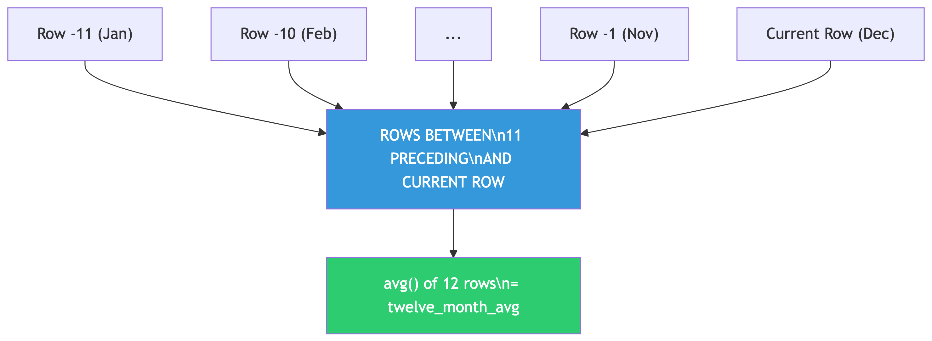
The OVER() clause defines the window frame:
ORDER BY year, month— chronological orderROWS BETWEEN 11 PRECEDING AND CURRENT ROW— 12-row window
As you move through the data, the window slides along. Hence “rolling” average.
Other useful frames:
| Frame | Effect |
|---|---|
ROWS BETWEEN 2 PRECEDING AND 2 FOLLOWING |
Centered 5-row window |
ROWS UNBOUNDED PRECEDING |
Running total from start |
ROWS BETWEEN 6 PRECEDING AND CURRENT ROW |
7-day rolling window |
Why 12 Months?
Because citrus exports have a 12-month seasonal cycle. A 12-month window cancels out the seasonal pattern and reveals the underlying trend.
Choosing Your Window Size
Match the window to the cycle length:
- Monthly seasonal data → 12-month window
- Daily data with weekly patterns → 7-day window
- Quarterly data → 4-quarter window
And a warning: missing time periods will throw off your averages! A missing month turns a 12-month average into a 13-month average because window functions count rows, not dates. 🚨
Sample Output
year month citrus_export_value twelve_month_avg
---- ----- ------------------- ----------------
2019     9            14012305         74465440
2019    10            26308151         74756757
2019    11            60885676         74853312
2019    12            84873954         74871644
2020     1           110924836         75099275
2020     2           171767821         78874520
2020     3           201231998         79593712
2020     4           122708243         78278945
Monthly values bounce between $14M and $201M. The 12-month average? Steady around $75M-$79M. Trend revealed. 📈
Beyond Averages: Rolling Sums
You can swap avg() for sum() to get rolling totals:
A 12-month rolling sum gives you the annual total ending on any given month. Great for year-over-year comparisons without waiting for December! 📅
✅ Knowledge Check: Window Functions
Try It Yourself!
Modify the rolling average query to use
soybeans_export_valueinstead of citrus. Do soybeans show the same seasonal pattern? (Hint: soybeans have a different growing season)Change the window to
ROWS BETWEEN 5 PRECEDING AND CURRENT ROW(6-month average). How does a shorter window affect the smoothing?Write a query that shows a running total of citrus exports using
ROWS UNBOUNDED PRECEDING. What does this represent?
🔑 Solution 1: Soybeans Rolling Average
Step 1: Swap the column name:
Step 2: Compare the patterns:
- Citrus peaks in winter (Dec-Mar) when northern hemisphere demand is high
- Soybeans peak in fall (Oct-Dec) right after the US harvest season
Both are seasonal, but with different cycles. The 12-month rolling average smooths both effectively because both have roughly annual patterns. The trend lines tell different economic stories: soybean exports surged due to trade dynamics, while citrus stayed relatively stable. 🌾🍊
🔑 Solution 2: Shorter Window
Step 1: Change the frame to 6 months:
Step 2: What changes?
| Window | Smoothing Effect |
|---|---|
| 12-month | Very smooth, seasonal pattern fully canceled |
| 6-month | Bumpy, seasonal peaks still visible |
A shorter window captures less than one full seasonal cycle, so the seasonal ups and downs bleed through. A 6-month average in citrus data still shows winter highs and summer lows, just dampened. You want your window to match (or exceed) the cycle length. 📉📈
🔑 Solution 3: Running Total
Step 1: Use sum() with ROWS UNBOUNDED PRECEDING:
Step 2: What does this represent?
ROWS UNBOUNDED PRECEDING means “from the very first row to the current row.” So each row shows the cumulative total of all citrus exports from January 2002 up to that month.
Step 3: Why is this useful?
- Track cumulative revenue or spending over time
- See when you hit milestones (“When did total exports cross $10 billion?”)
- Compare cumulative performance across years
The running total only goes up (assuming positive values), creating a staircase pattern. The slope of that staircase is the trend. Steeper = faster growth. 📈
Putting It All Together 🧩
Summary
Your SQL Statistics Toolkit
| Tool | Function | Question It Answers |
|---|---|---|
corr(Y, X) |
Correlation | “Are these related?” |
regr_slope() / regr_intercept() |
Regression | “Can I predict Y from X?” |
regr_r2() |
R-squared | “How good is my prediction?” |
var_pop() / stddev_pop() |
Spread | “How spread out is the data?” |
rank() / dense_rank() |
Ranking | “What’s the order?” |
PARTITION BY |
Grouped windows | “Rank within each group” |
ROWS BETWEEN ... AND ... |
Frame clause | “Smooth or accumulate over time” |
When to Use SQL Stats vs. External Tools
SQL is great for:
- Quick exploratory analysis
- Data already in the database
- Simple correlations and regressions
- Ranking and top-N queries
- Rolling averages and running totals
- First pass before deeper analysis
Use Python/R when you need:
- Multiple regression and ML models
- Publication-quality visualizations
- Hypothesis testing with p-values
- Non-linear relationship modeling
- Custom statistical methods
- Significance testing
SQL gets you 80% of the insight for 20% of the effort. That’s a trade worth making. 📈
🎯 Final Challenge
Comprehensive Analysis
Using the acs_2014_2018_stats table, write queries that:
- Find the correlation between
pct_masters_higherandmedian_hh_income - Compute the regression equation to predict income from master’s degree percentage
- Calculate R² for this relationship
- Rank all states by their average median household income (you’ll need
GROUP BY+rank() OVER()) - For each state, show the standard deviation of income across its counties
Bonus: Which state has the highest average income? Which has the most variation within its counties?
Try It Yourself (from the textbook)
Chapter 11 Exercises
Write a query to show the correlation between
pct_masters_higherandmedian_hh_income. Is the r value higher or lower than bachelor’s? What might explain the difference?Create a 12-month rolling sum using
soybeans_export_value. Graph the results. What trend do you see?Bonus: If you have the libraries data from Chapter 9 (
pls_fy2018_libraries), rank library agencies by visits per 1,000 population for agencies serving 250,000+ people.
Further Reading
- Practical SQL, 2nd Edition — Chapter 11, by Anthony DeBarros
- PostgreSQL docs: Aggregate Functions
- PostgreSQL docs: Window Functions Tutorial
- PostgreSQL docs: Window Function List
- Fun: Spurious Correlations
- Deep dive: Statistics by Freedman, Pisani, and Purves
Happy querying! May your correlations be strong and your p-values be low. 🎉